What was tried in the classroom?
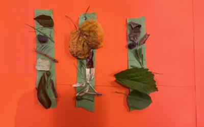
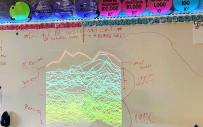
In my classroom, I was able to try different ways to view data and to interact data. For example, instead of seeing line graphs or bar graphs of populations, CO2 levels, or beak sizes, we began to interpret the data using colors and figures on the actual data set. Students were taken off guard that we were going to get artistic with data, but they soon began to realize this is fun and that it is another way to tell a story.
How’d it go?
It went ok for the first time. I had never done something like this before for myself or the students, so I did not have an expectation besides using colors to interpret what the data was saying. Some pictures were creative and elaborative while others were simple and basic. Either way, I am happy to get the experience and can figure out ways to fine tune this teaching strategy.
ClimeTime Training
EarthGen’s Climate Emotions and Creative Expressions STEM Seminar
Classroom
School: Pasco High School
District: Pasco School District #1
Teacher: Jose Mejia